Most product pages still look like they were built in 2015. A few photos, a description, a price, an add-to-cart button. That was fine when people browsed your site top to bottom. They don't anymore. They land straight on the product page from an ad or a reel, already halfway to buying, or halfway to bouncing. That one page has to do the whole job now.
- A few product photos
- A description
- A price
- An add-to-cart button
Flat. Not enough anymore.
- Video that moves
- A buy button that follows you
- Every objection answered
- Proof that looks like a TikTok
- The story and the science
- A reason to add one more
Sells, educates, proves. On one page.
Your shopper is already scrolling
They came from TikTok, Instagram, an ad, a creator. They're in a scrolling mindset, used to video, movement, proof, and fast answers. Then they hit a flat product page and the momentum dies.
Your job is to keep that going, not stop it dead. The page should feel like the next swipe, not a form to fill in.
A modern product page isn't a spec sheet. It's a landing page that happens to sell one thing.
Treat it like a landing page
On one page it has to sell, educate, prove, inspire, and get the click. Don't be scared of length. A long page that answers every question beats a short one that leaves people guessing. Half the time this is the first page someone sees, and the only one, so it carries the whole shop.
The eight things an epic product page has
- An above-the-fold that sells in three seconds. Product, the one-line promise, price, rating, and the buy button, all there before anyone scrolls. Especially on a phone.
- Video, not just photos. The top of the page should move. The product in use, on a real person, in context. Match the energy of the ad they just clicked.
- A buy button that follows them. Sticky add-to-cart, so the second they're sold, they can act, wherever they are on the page.
- Objections answered before they're asked. Sizing, ingredients, how to use it, shipping, returns, "is this for me". Out in the open, not buried in dropdowns.
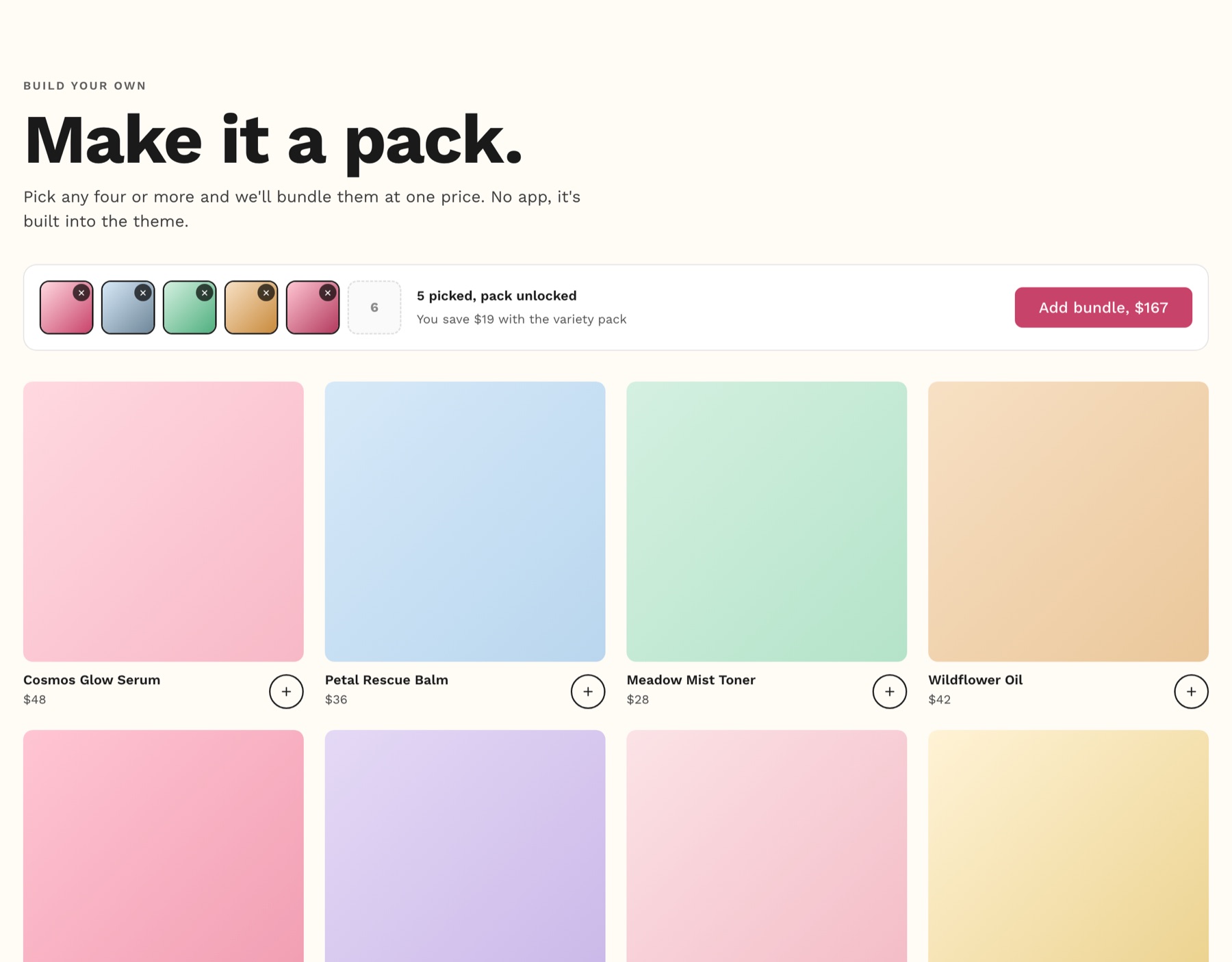
- A reason to add one more. Pairs-well-with, "make it a pack", a free-shipping nudge. Lift the basket while they're already deciding.
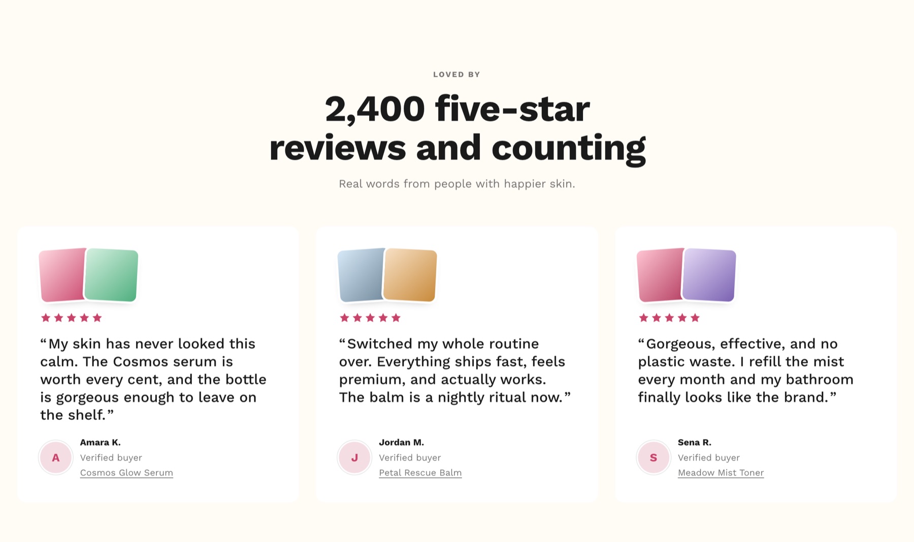
- Social proof that looks social. Not just a star rating. Video that feels like a TikTok: people using it, showing results, talking through why they love it.
- The good stuff out of the dropdowns. If the ingredients, materials, or craft are worth anything, show them. Then build the world around the product: a full-width video, the story, why it exists.
- Proof, not promises. If it promises a result, show it. Before and after, the science, the testing, real customer results. Don't ask people to trust you.
Here's what a few of those look like
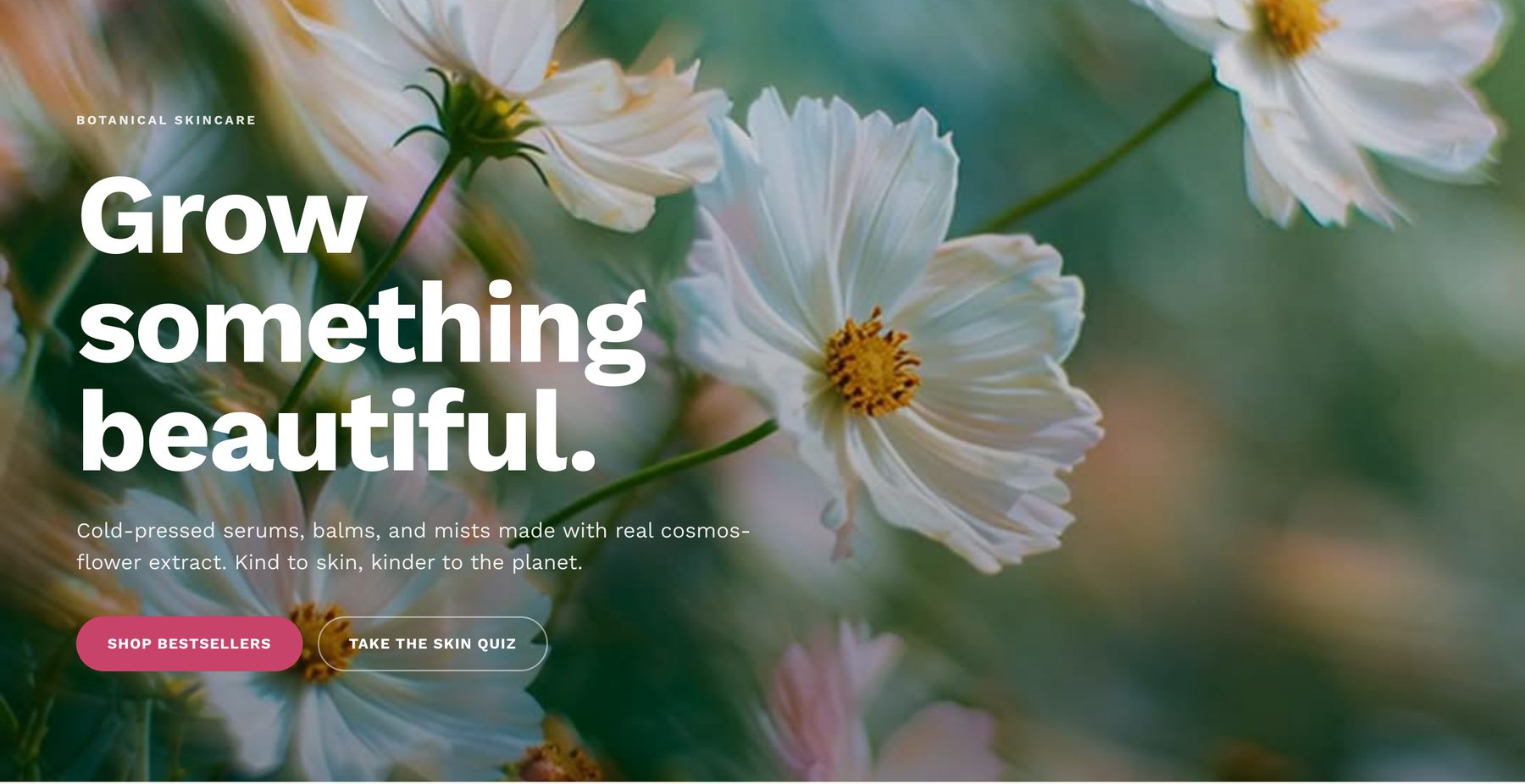
These are real sections from Sherbet, the theme we build stores on. Same idea on any page.
Don't ask people to trust you. Make the yes feel obvious.
We build this in, not bolt it on
Every one of those is a section in Sherbet: sticky add-to-cart, a real reviews and video block, trust badges, an FAQ, the "make it a pack" bundle builder. No stack of apps charging you monthly for each one. Then we test it, one change at a time, and keep what wins.
Open your best-selling product page right now and count how many of those eight it actually does. If it's three, that's your list. Want us to build the other five? Talk to us.