Most of what makes a product page sell is boring: say what the thing does, show the real price, answer the questions, prove other people bought it. Shopify can do nearly all of it without an app if you know where the setting lives. These are the ten we build into every store, in the order a shopper meets them.
- The one-line promiseUnder the title
- The price they actually payCompare-at price
- The obvious pickA label on your real best seller
- A button that follows themSticky add to cart
- Honest stock countsLiquid, five lines
- When it shipsA line under the button
- How to use it, right thereMetafield plus theme block
- FAQs about this productNot about your returns policy
- Reviews that look realPhotos, in the HTML
- A reason to add one moreShopify Bundles
1Say what it does in one line
Put one sentence under the product title that says what the shopper gets, not what the product is. "Soy wax candle, 200g" is a spec. "Fills the lounge with orange blossom" is a reason to buy. Most themes have a text block for the product info area. Add it in the theme editor and connect it to a product metafield, so every product gets its own line without a template per product.
2Show the price they actually pay
If something is on sale, don't make people work it out from a discount code. Set the compare-at price on the variant in the admin and the theme shows the old price struck through next to the new one, and most themes add a sale badge too. Only use it for a price you really charged. A made-up "was" price is the fastest way to lose a customer's trust.
3Label the pick you want them to make
When there's a choice (one candle or three, 100ml or 250ml), a small "Most popular" label tells a hesitant shopper what to do. Make it true. Check Analytics > Reports for sales by variant and put the label on the option people already buy most. A product tag plus a badge in the theme does it across the whole catalogue.
4Make the button follow them
On a phone the add-to-cart button scrolls away after the first screen. Then the shopper reads your reviews, gets convinced, and has to scroll back up to act. A sticky add-to-cart bar that appears once the main button is off-screen fixes it. Many 2.0 themes include one; check the product page settings before you pay for an app.
The button itself should be the strongest colour on the page. If your brand colour is everywhere, it can't also be the button.
5Show stock counts only when they're true
- "Only 4 left" from real inventory
- A sale end date that actually ends
- "Ships today" when it does
- Countdown timers that reset on refresh
- "23 people are viewing this"
- Low-stock bars on items you have 400 of
Real scarcity sells. Fake scarcity gets screenshotted. A candle store we run shows "Only 4 left" under its buy button. You don't need an app for it. This goes in the product template, near the button:
{%- assign v = product.selected_or_first_available_variant -%}
{%- comment -%} Only when Shopify tracks stock, and only when it's actually low {%- endcomment -%}
{%- if v.inventory_management == 'shopify' and v.inventory_quantity > 0 and v.inventory_quantity <= 5 -%}
  <p class="low-stock">Only {{ v.inventory_quantity }} left</p>
{%- endif -%}
One catch: this renders for the first variant when the page loads. On a product with several variants, your theme's variant-change script has to update it too, or it shows the wrong number.
6Say when it ships
"When will I get it?" is the question that stops a lot of carts. Put a line under the button: "Order before 2pm, ships today." Say ships, not arrives, unless you control the courier. A promise you can keep beats a faster one you can't. The store above uses a dispatch line in the same spot.
7Put "how to use it" where they decide
Size guides, care instructions, "how long does it last". This belongs next to the variant picker, for this product only. A size guide that opens a chart of every garment you sell makes the shopper do your job. Store it in a product metafield and connect a collapsible tab or popup block to it in the theme editor, so it only shows on products that have one.
8Answer questions about this product, not your store
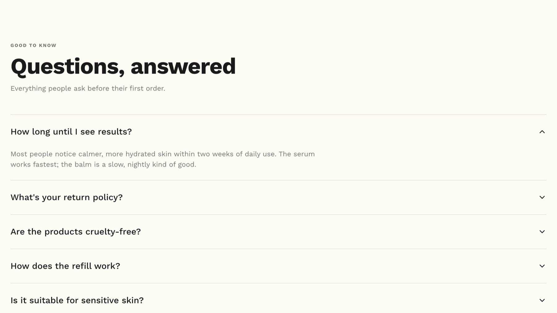
"Do you ship to Namibia?" belongs on your shipping page. The product page FAQ is for "Will this scent fill an open-plan room?" and "Can I reuse the jar?". Get the questions from your inbox and your reviews. Keep them in metafields so they render in the page's HTML, which also means AI assistants can read them. An FAQ app that loads after the page is invisible to them.
9Get reviews that look like real people
Star ratings are table stakes. Photo and video reviews are what convince people. Two things make the difference:
- Ask at the right time. Send the review request 10 to 14 days after delivery, not after dispatch. Nobody can review a candle they haven't lit yet. A Klaviyo flow triggered by Fulfilled Order, with a delay long enough to cover delivery, does this.
- New store, no reviews? Send product to 10 or 15 real customers or friends through a normal order, so the review request goes out the normal way. Don't write them yourself.
10Give them a reason to add one more
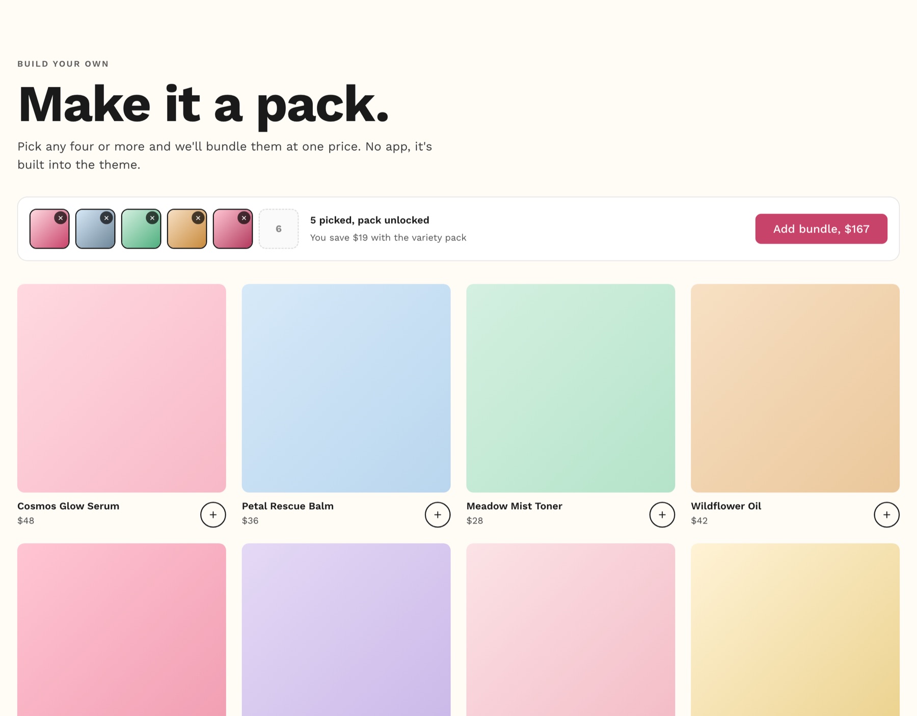
"Make it a set of three" or "pairs well with" lifts order value without a discount code. Shopify's own Bundles app is free and builds fixed bundles that track inventory properly. Try it before paying monthly for a bundle app.
None of these need a redesign. They need someone to go into the admin and switch them on.
The popular tip we'd test before copying
You'll often hear "remove the Buy it now and Shop Pay buttons from your product page". The argument is that they skip the cart, so shoppers never see your upsells. Sometimes that's right. It's also the fastest way to check out for a returning customer on a phone.
Don't just delete them. It's one checkbox in the theme editor (Show dynamic checkout buttons on the buy buttons block), so turn it off for a month, compare conversion rate and average order value to the month before, and keep whichever made more money. On a one-product store, leave them on.
Open your best-selling product on your phone and go down the list. Count how many it already does. Want us to build the rest? Talk to us.